Free
Stopwatch. Expanding the concept.

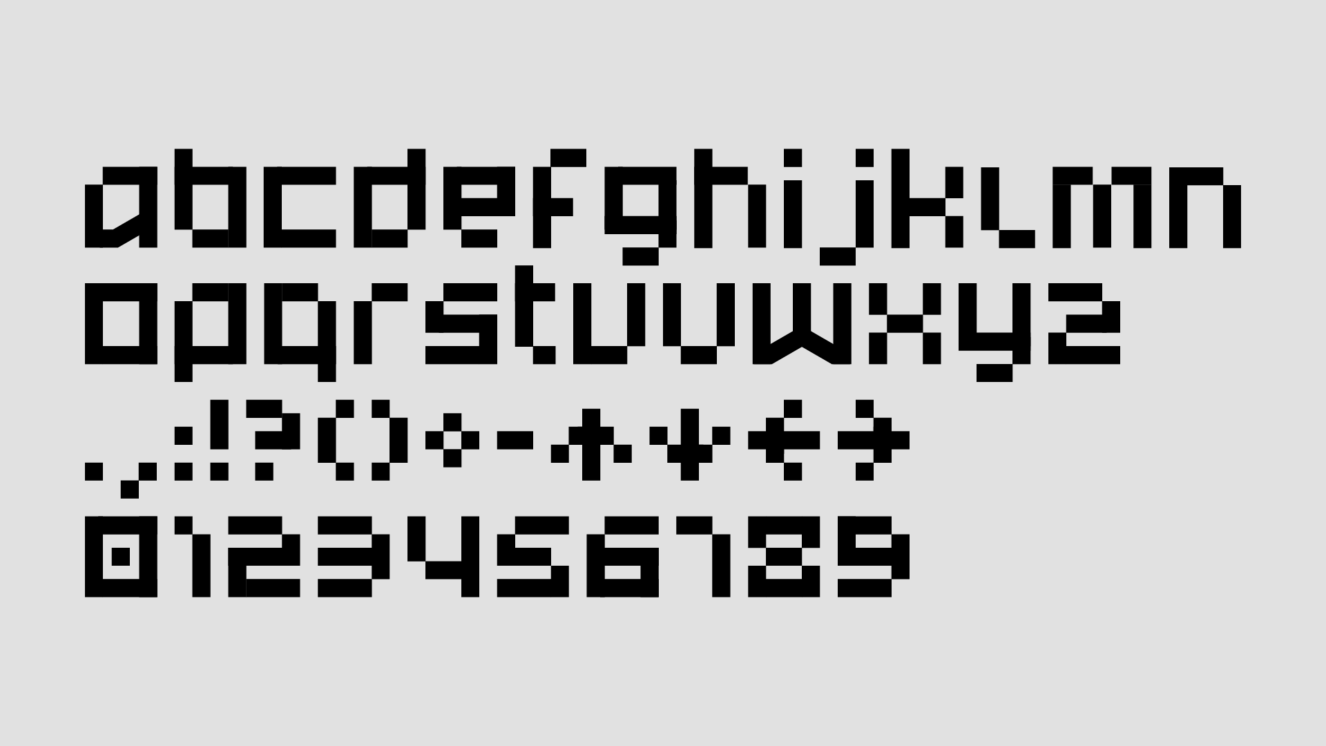
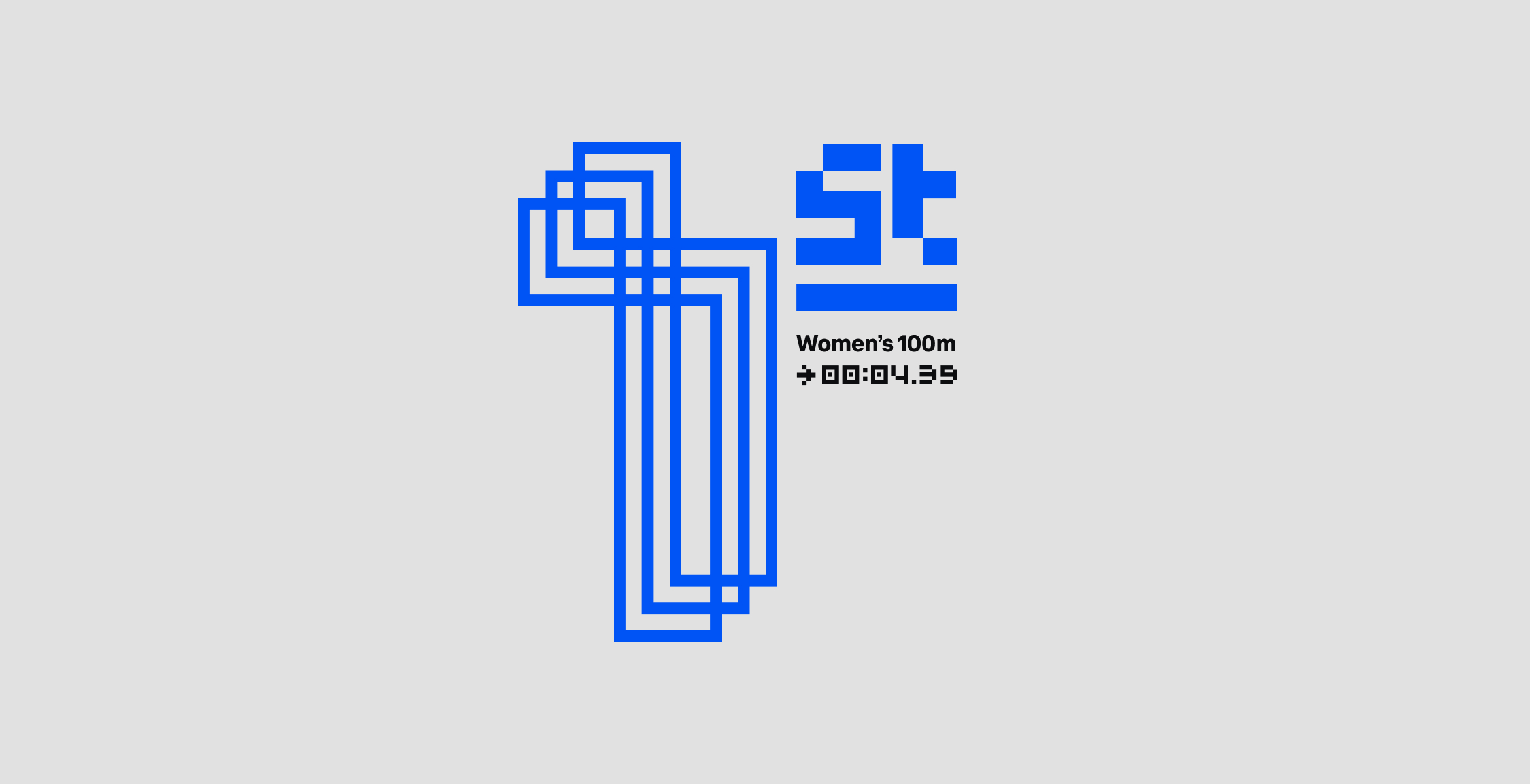
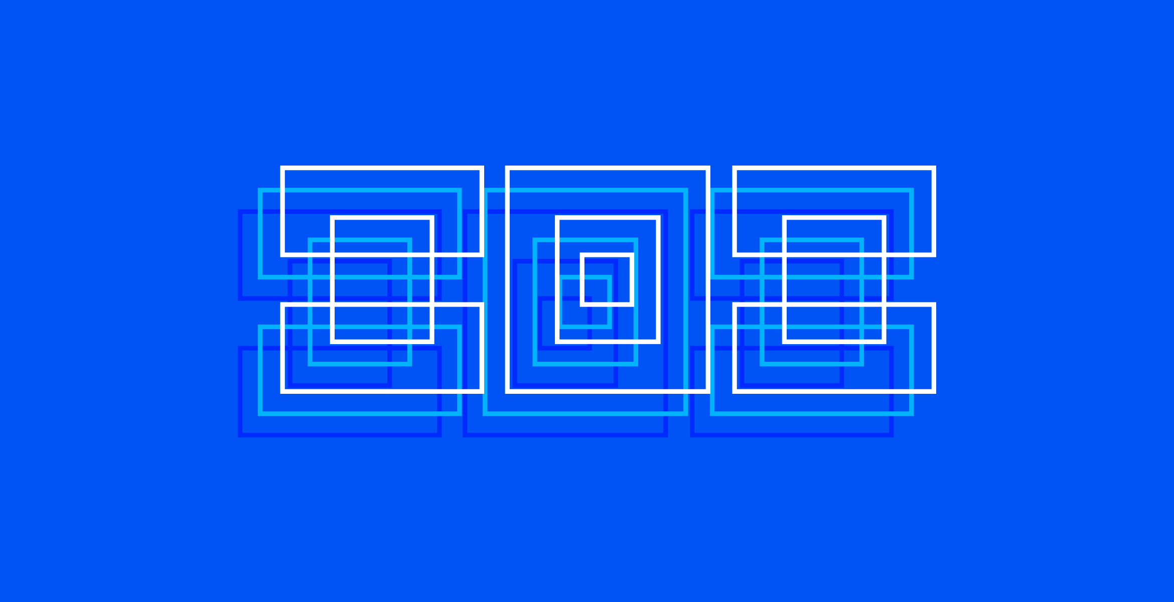
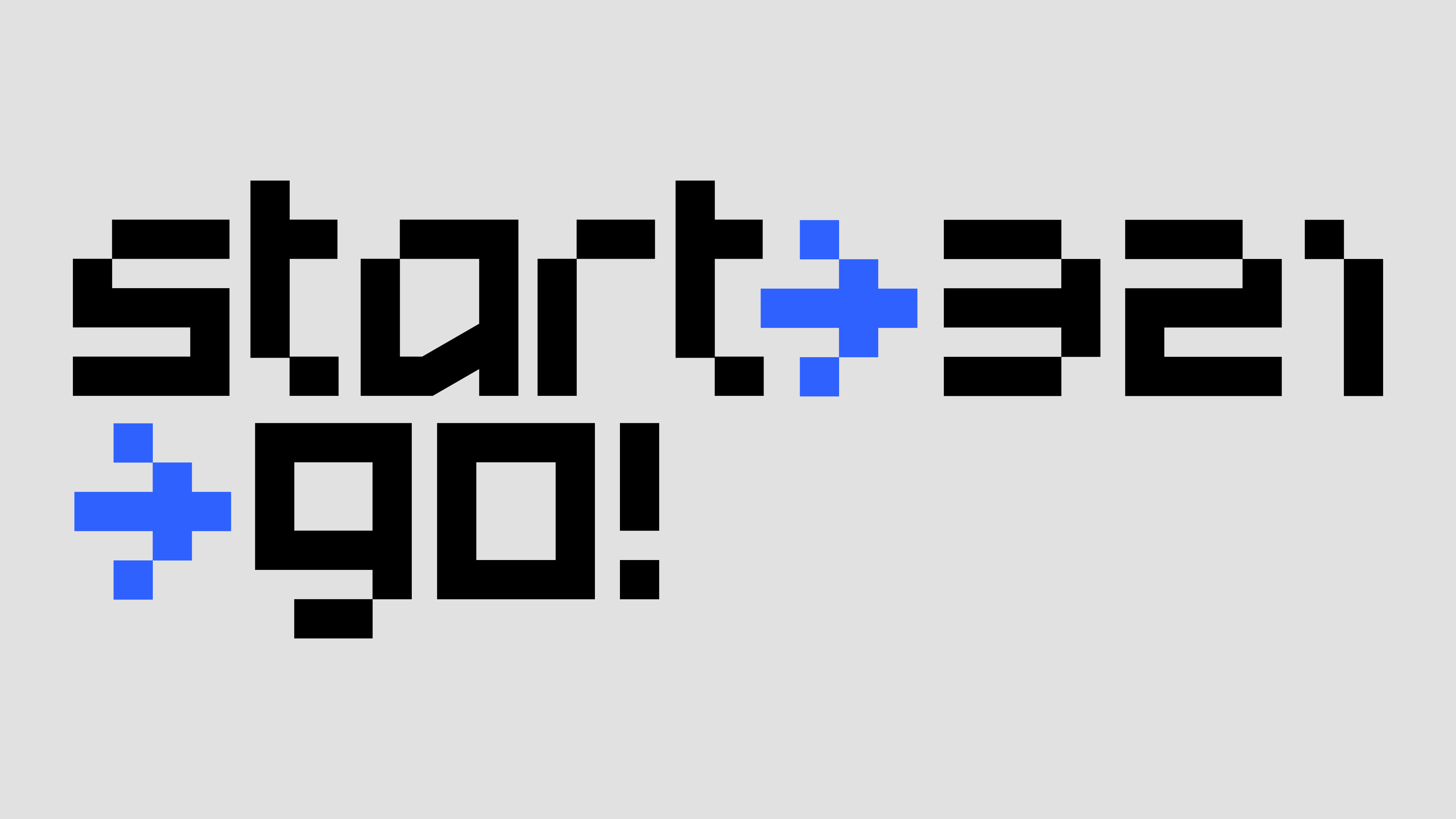
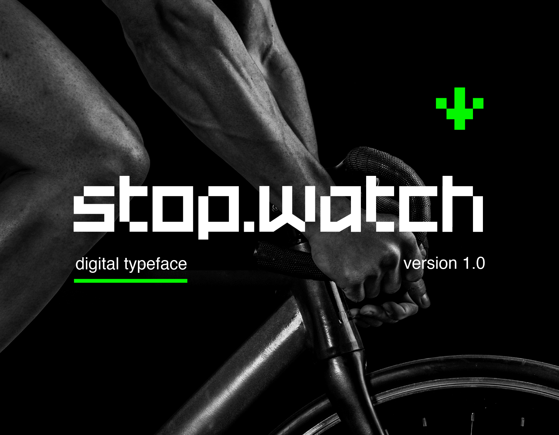
A typographic experiment designed initially as part of an on-air graphics pitch. Stopwatch is influenced by digital readouts of various kinds – the typeface features a few quirky letters and a couple of always useful arrows. The display typeface looks great in bold 'in yer face' layouts or outlined and doubled up as shown in the examples below.
Stopwatch is Free for Personal and Commercial use.
