Wndo
The time zone app for team alignment
Summary
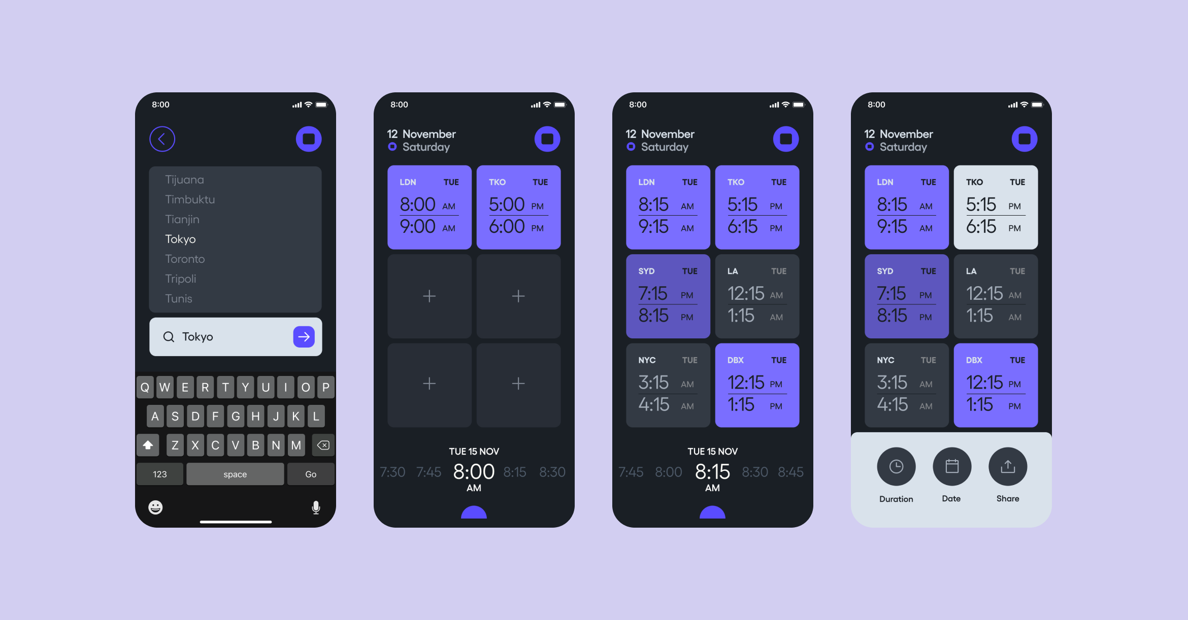
Quickly find the time when communicating with teams across time zones. WNDO aligns teams around the world with a simple and clean interface
Challenge
When communicating across regions, it can become tedious finding the right time that aligns with everyone. Finding a way where you can quickly see a snapshot of everyone's location and time and the ability to share or send a meeting invite.
Process
Utilising a competitive analysis to find the current time zone app/site landscape was an easy task as I have been using many apps and relying on sites to get this experience with various degrees of success. In this case I am the user and my findings were confirmed with these same pain points expressed from my clients and colleagues over the past ten years.
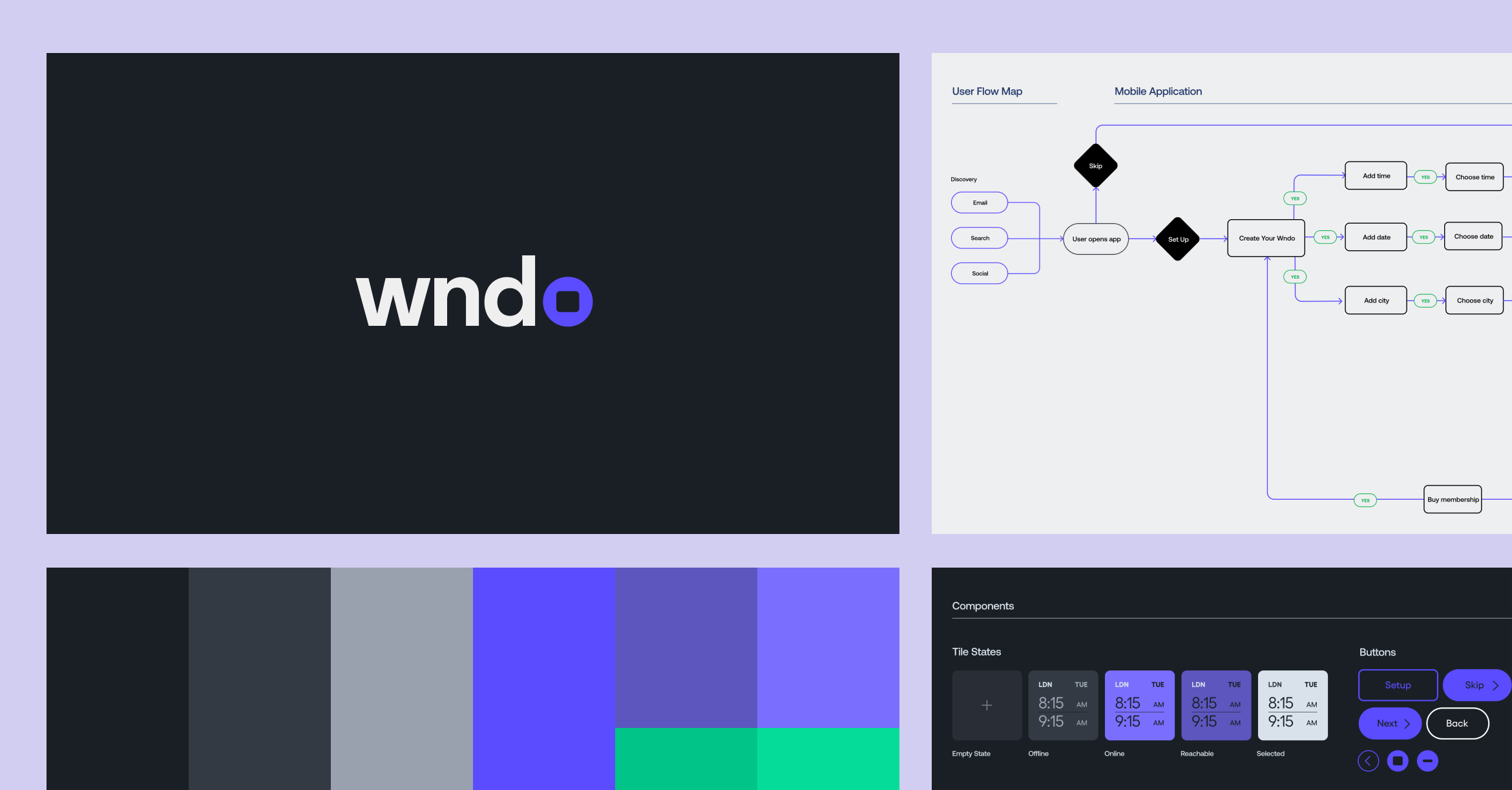
Following on from this I started with sketches, user flows and lo-fi mockups then onto prototypes, user testing and design direction.
Solution
An app which finds your time zone and others in a simple and convenient way using a customisable and clean user interface.
Category
Product Design
Status
In Progress
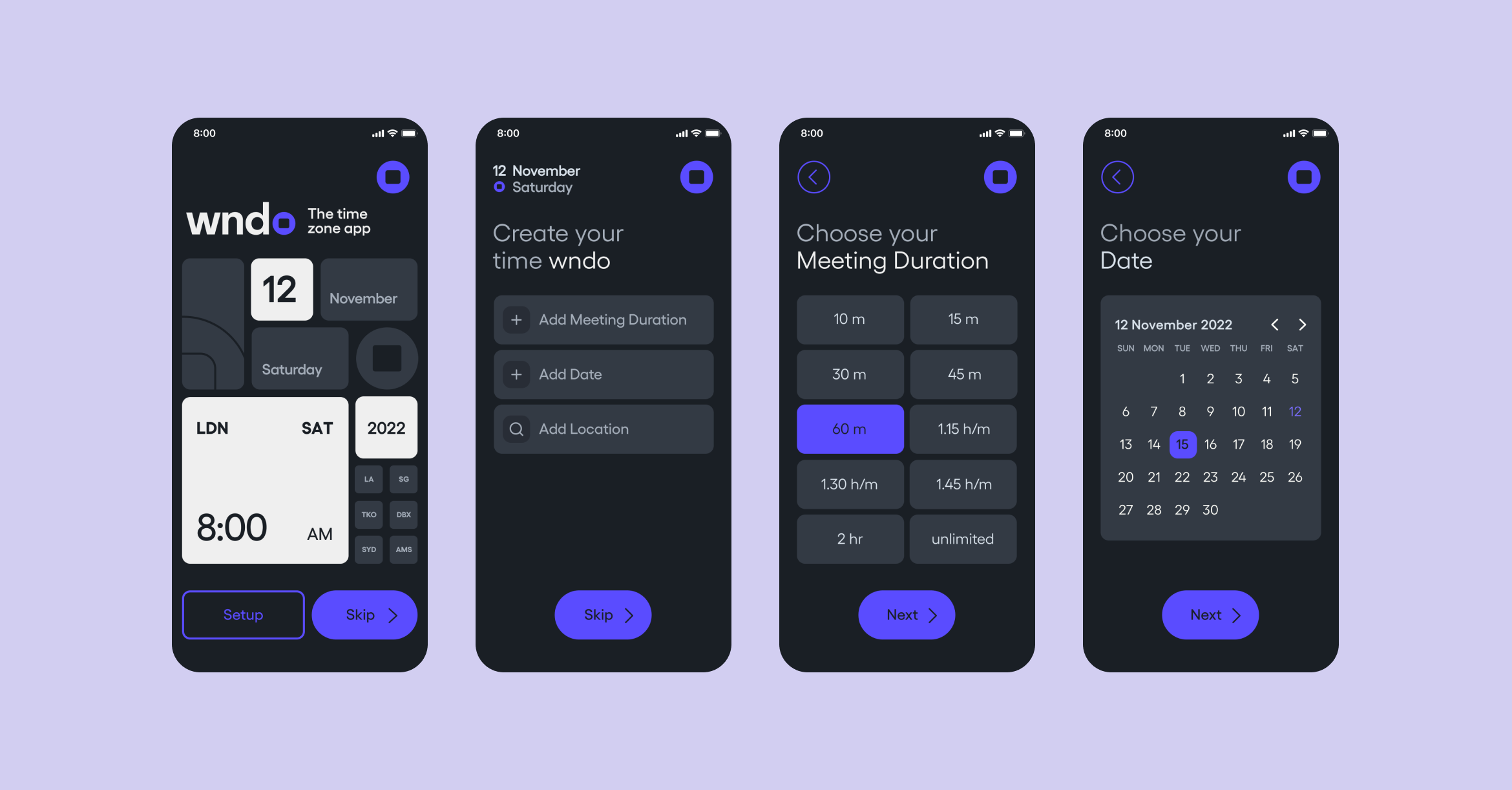
Wndo setup
Tile view and share
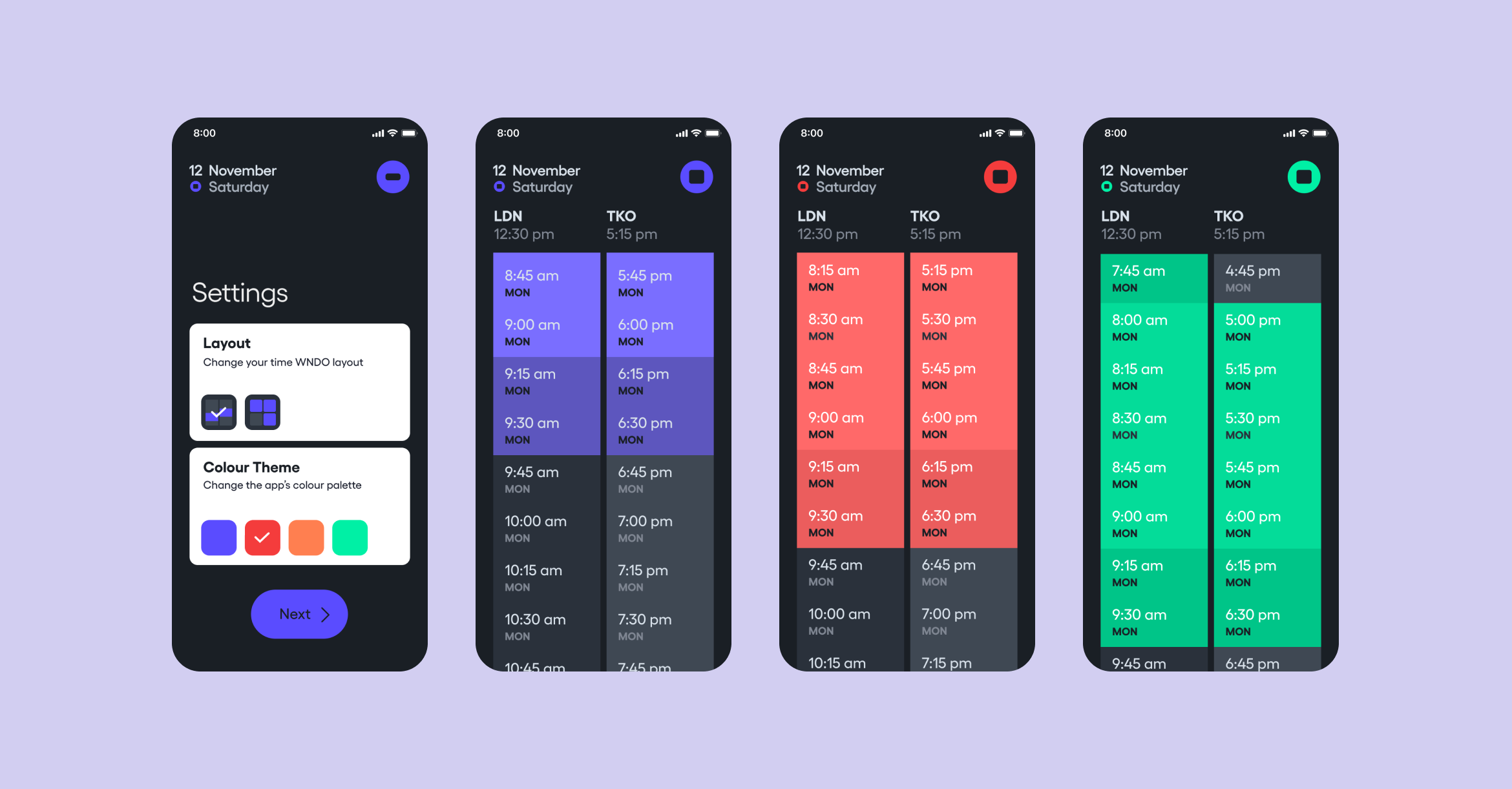
Settings and an alternative Scroll view
